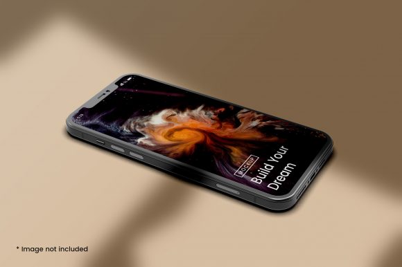
Understanding iPhone Mockups for Mobile Phone Screen Presentations
When you need to showcase a mobile app design, a website interface, or any content intended for a smartphone, the way you present it matters almost as much as the design itself. An iPhone mockup for mobile phone screen presentations is a visual representation that places your design into the familiar silhouette of an iPhone, often including bezels, a notch, and sometimes even a hand holding the device. This approach has become a standard tool for designers, marketers, product managers, and developers who want to communicate how a screen will look and feel in a real-world context.
But an iPhone mockup is not the only way to present a mobile screen, and it is not always the best choice. Understanding what it offers, where it falls short, and how it compares with other approaches can help you decide when to use it and when to reach for something different. This article explores the distinct qualities of iPhone mockups, their strengths and tradeoffs, and the decision factors that matter most when choosing how to present a mobile phone screen.
What Makes an iPhone Mockup Distinct from Other Screen Representations
An iPhone mockup for mobile phone screen presentations is fundamentally a contextual frame. It takes a flat screenshot or a rendered design and places it inside a realistic device image. The result is a visual that suggests how the screen would appear if the user were holding an iPhone in their hand. This context adds a layer of realism that a plain screenshot cannot achieve.
The distinctiveness lies in several details. First, the bezel and notch of the iPhone are recognizable design elements that anchor the viewer’s expectation. For many audiences, particularly in markets where iPhone usage is high, this familiarity builds trust and immediacy. Second, a well-made mockup includes subtle reflections, shadows, and gradients that mimic real lighting conditions. These details make the screen feel less like a flat graphic and more like a physical object. Third, iPhone mockups often come in multiple angles – front-facing, slightly tilted, or held in a hand – which adds visual variety and can emphasize different aspects of the design.
Compared with a bare screenshot, an iPhone mockup offers immediate visual context. Compared with a wireframe or a low-fidelity prototype, it feels finished and polished. Compared with a fully interactive prototype, it is static but also faster to produce and easier to embed in presentations, landing pages, or marketing materials. This middle ground – more polished than a wireframe, less dynamic than a live prototype – is where the iPhone mockup lives, and it serves a specific set of needs well.
Comparing Approaches: When a Mockup Fits and When It Does Not
No single presentation method works for every situation. The iPhone mockup for mobile phone screen presentations competes with several alternatives, each with its own strengths. Understanding the landscape helps you match the tool to the task.
Static screenshots without a device frame are the simplest option. They load quickly, take up less space, and keep the focus entirely on the interface. If you are sharing a design internally with a team that already understands the context, a plain screenshot may be sufficient. The tradeoff is that without a frame, the screen can feel detached from the device, and viewers may not immediately register that they are looking at a mobile interface.
Interactive prototypes built in tools like Figma, Sketch, or Adobe XD allow users to tap, swipe, and navigate through flows. These are invaluable for usability testing and stakeholder walkthroughs because they simulate real interaction. However, they require more time to build, and they are harder to embed in static documents, PDFs, or slide decks. An interactive prototype also demands that the viewer engage actively, which is not always appropriate for a quick overview or a marketing asset.
Cross-platform device frames show the same screen on multiple devices simultaneously, such as an iPhone next to an Android phone and a tablet. This approach is useful when you need to demonstrate responsiveness or when your audience uses a mix of platforms. The downside is that including multiple frames can clutter the visual and dilute the focus on the design itself.
Video or animated mockups add motion – a screen sliding in, a button press, a transition. These are engaging for social media or product demos, but they are overkill for documentation, early feedback rounds, or print materials. They also introduce file size and compatibility considerations.
An iPhone mockup sits between these extremes. It provides more context than a plain screenshot, less effort than a prototype, and a focused single-device view. It is a pragmatic choice for many common scenarios, but it is not a universal solution.
Strengths and Tradeoffs of Using an iPhone Mockup for Your Mobile Screen
Every method has its strengths and tradeoffs. Knowing them allows you to use an iPhone mockup intentionally rather than by default.
Strengths
Immediate visual context. The iPhone silhouette tells the viewer instantly that this is a mobile screen. There is no confusion about whether the design is for a desktop, a tablet, or a phone. This speed of recognition is valuable in presentations, client meetings, and marketing materials where first impressions matter.
Enhanced perceived polish. A design placed inside a realistic mockup often looks more finished than the same design shown flat. The frame, reflections, and shadows give the screen a sense of depth and tangibility. For client-facing work or public-facing assets, this polish can build confidence in the design.
Brand consistency. The iPhone aesthetic carries its own brand associations. For audiences that equate iPhone with premium design, using an iPhone mockup subtly reinforces a quality message. This is not manipulation – it is simply recognizing that the frame itself communicates meaning.
Ease of use and speed. Good iPhone mockup templates are widely available. You can drop a screenshot into a smart object in Photoshop, use a browser-based generator, or insert a vector frame in Figma. The process takes minutes, not hours.
Tradeoffs
Platform bias. Using an iPhone mockup exclusively can imply that your design is iOS-only, even if it is actually cross-platform. For Android users or for projects that emphasize device agnosticism, an iPhone frame may send the wrong signal. If your audience is mixed, consider alternating with Android mockups or using a neutral device silhouette.
Static limitation. A mockup does not show interaction. If your goal is to demonstrate a user flow, a tap, or a swipe, a static image will fall short. Stakeholders may misinterpret the static image as the final state, missing the dynamic aspects of the design.
Visual clutter. The bezel, notch, and hand can sometimes distract from the screen content. If your design is complex or detail-dense, the extra visual elements may compete for attention. Minimalist presentations are sometimes better served by clean, frameless screenshots.
Over-reliance on a single device. The iPhone screen size and aspect ratio are specific. Showing a design only in an iPhone mockup can mask how it behaves on smaller or larger screens, or on devices with different notch shapes. Responsive design requires broader testing and presentation.
Key Decision Factors for Choosing the Right Mobile Screen Representation
When you are deciding whether an iPhone mockup for mobile phone screen is the right choice, consider the following factors. Each can shift the balance toward or away from this approach.
Audience expectations. Who will view this presentation? If you are presenting to iPhone users, a design team familiar with iOS, or a client who values visual polish, the iPhone mockup reinforces familiarity and quality. If your audience uses Android exclusively or works in a cross-platform environment, a neutral or multi-device approach may be more appropriate.
Purpose of the presentation. Are you seeking feedback on layout and aesthetics, or are you testing usability and flow? For aesthetic evaluation, a static mockup is often sufficient. For usability, you need interactivity. For marketing, you need visual appeal and quick comprehension. Match the method to the primary goal.
Fidelity level needed. Early in the design process, low-fidelity wireframes or plain screenshots may be better because they invite feedback on structure rather than on visual polish. Later in the process, when the design is refined, a high-fidelity iPhone mockup helps communicate the final look. Using a mockup too early can make stakeholders focus on colors and shadows instead of on content and navigation.
Distribution format. Where will the presentation live? In a slide deck, a PDF portfolio, a blog post, or a social media image? An iPhone mockup works well in all these formats because it is self-contained and visually complete. For email newsletters or thumbnails, a mockup can be more recognizable than a bare screenshot. For interactive design specs or handoff documents, a prototype or annotated screenshot may be more practical.
Time and resources. Creating an iPhone mockup is fast, but it still requires a template and a few steps. If you are iterating rapidly and producing dozens of screens, the overhead of placing each one into a mockup adds up. In those cases, batch processing tools or a simple screenshot may be more efficient. Reserve mockups for final or client-facing versions.
Practical Examples and Use Cases
To see how these factors play out, consider a few realistic scenarios.
Example 1: Presenting a new app concept to a client. You have designed three home screen variations for a fitness tracking app. The client is not technical and needs to imagine the app on their own phone. An iPhone mockup for each variation helps the client see the design in context, compare the options, and give feedback on visual appeal. The static nature works here because the discussion is about look and feel, not about button behavior.
Example 2: Sharing a prototype for user testing. You need to test the checkout flow for an e-commerce app. Users need to tap, scroll, and enter information. A static iPhone mockup will not suffice. Here, an interactive prototype is essential. You might still use an iPhone mockup for the recruitment material or the test instructions, but the test itself requires live interaction.
Example 3: Designing a responsive website that works across devices. Your design team needs to review how the same page appears on an iPhone, an Android phone, and a tablet. Using only an iPhone mockup hides the Android and tablet experiences. In this scenario, a set of mockups covering multiple devices, or a responsive preview tool, is more appropriate.
Example 4: Creating a portfolio piece for a job application. You want to showcase a past project with polished visuals that hiring managers will immediately understand. An iPhone mockup for mobile phone screen presentations gives your portfolio a professional, finished look. It signals that you care about presentation and that you understand how design translates to the device.
Making the Right Choice for Your Project
The iPhone mockup is a versatile and effective tool, but it serves a specific role. It is best when you need to provide visual context quickly, when your audience benefits from the familiarity of the iPhone frame, and when the design is polished enough to warrant the presentation. It is less ideal when you need to demonstrate interactivity, when your design must be shown across multiple platforms, or when you want to keep the focus purely on the interface without any visual distractions.
There is no single right answer for every project. The best approach depends on your audience, your goal, and the stage of your work. By understanding what an iPhone mockup for mobile phone screen does well – and where it falls short – you can make an intentional choice that serves your design and your viewers. Use it when it adds clarity and impact. Use something else when the situation demands a different kind of communication.
The key is to treat the mockup as one option among many, not as a default. With a clear sense of what each approach offers, you can present your mobile screens in a way that is honest, effective, and appropriate for the moment.